Suggestions for Designing for Color Blindness
First, while the Color-Blindness Simulator here is a good testing tool, it only works with images. Something that color converts a web page directly would be nice; perhaps a browser extension or even an operating system level color converter.
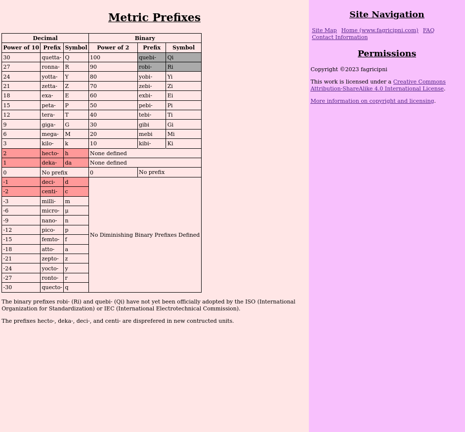
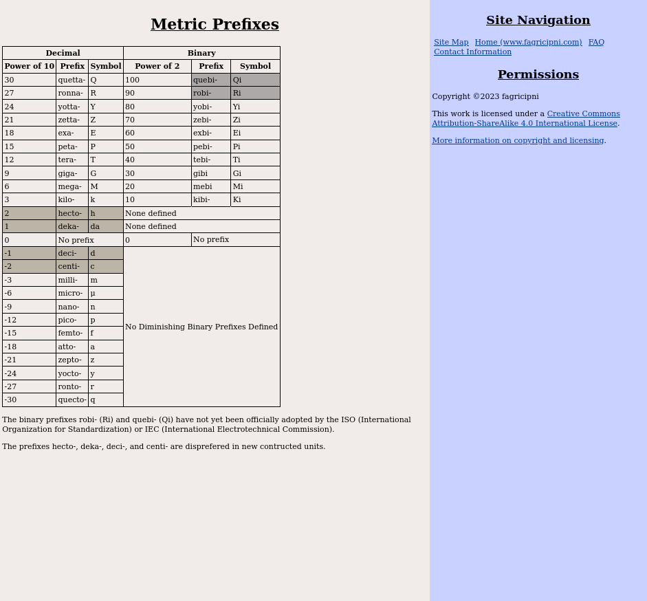
However, I don't use a wide variety of color schemes on my pages; so I took screenshots of a few sample pages to try out the simulator on. There are three pages of note here. First my Metric and Binary Prefixes page: here is are image files of the screenshot of Prefixes without filtering and the screenshot of Prefixes through the protanopia filter. Here, my background color for the unofficial binary prefixes and my background color for the "deprecated" prefixes is very similar to a protanope. This confusability causes me a bit of concern, because while the text at the bottom of the table does give the same information as in the table, it is a bit more difficult for a protanope to take in the table at a glance.
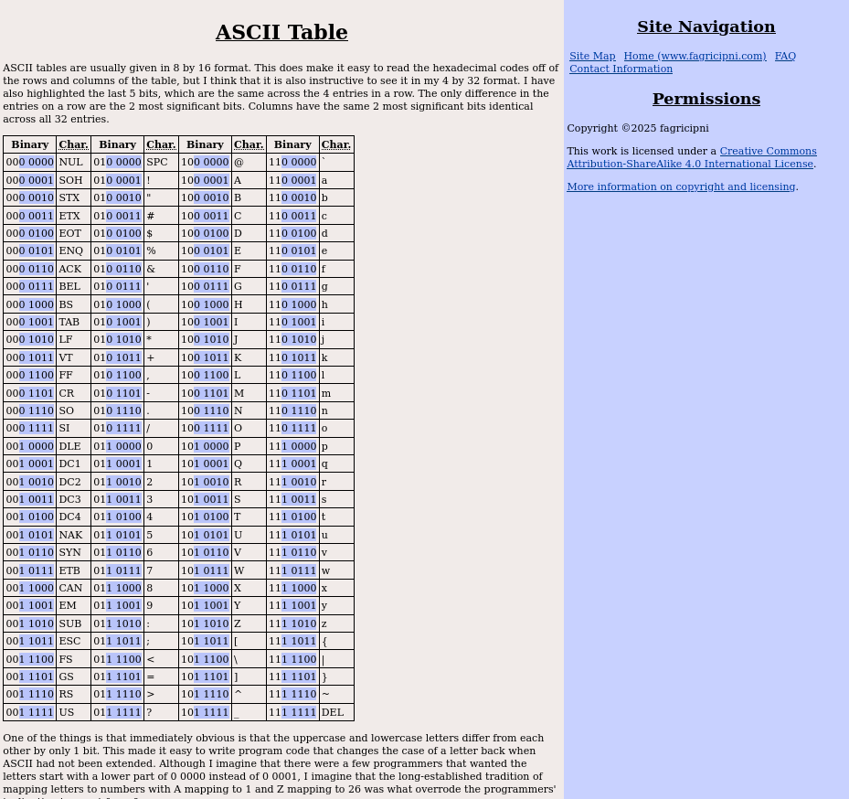
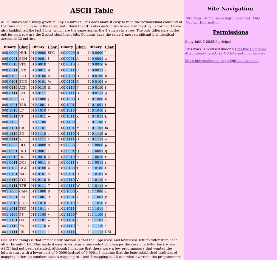
The other case I show images of here -- my ASCII table page -- causes me no concern, even though looking at the screenshot of ASCII Table through the protanopia filter as compared with the screenshot of ASCII Table without filtering shows even more similarity between the sidebar color and the highlight color in the table as viewed by a protanope than the Prefixes page. However, there is no need to distinguish between the sidebar color and the highlight color; the contrasts that matter are the distinction between the highlight color and main content background, and the distinction between the background colors of the main content and sidebar.
The other pages of note are my resistor pages; e.g., my Table of All E24 Resistor Values page. Here, I don't show images but all of the simulations of color-blindness mess with confusability of the colors used, however, a color-blind person would also have as much trouble, if not more, sorting real resistors. I have actually given the colors in words as well, but honestly I don't think that that is really needed. The most likely case would be where a color-normal person is printing the page on a grayscale printer for reference away from the computer -- and I can imagine a few less likely scenarios; e.g., someone is looking at my page on a monochrome terminal with Lynx (Wikipedia article on Lynx) --; so it is best that I include the words for those kinds of cases, but changing the displayed colors to better suit those with color-blindness is not an option that has any real utility.
The Brewer Palette
The following was derived from Joe Clark's Building Accessible Websites book. While even the author admits that "[s]ome of the advice in the book is now outdated" (source), I find that the Brewer palette is useful to me in trying to come up with good combinations for people with color-blindness:
| Axis | Colors | |||||
|---|---|---|---|---|---|---|
| red/blue | dark red | medium red | light red | light blue | medium blue | dark blue |
| orange/blue | dark orange | medium orange | light orange | light blue | medium blue | dark blue |
| orange/purple | dark orange | medium orange | light orange | light purple | medium purple | dark purple |
| yellow/purple | yellow | light purple | medium purple | dark purple | ||
| brown/blue | dark brown | medium brown | light brown | light blue | medium blue | dark blue |
| yellow/blue | yellow | light blue | medium blue | dark blue | ||
While I only caught the problem with my Prefixes page on using a color-blindness simulator -- and so recommend using one in addition to learning from reading about color-blindness --, this "what not to do" does explain what causes the trouble: "[r]ed appears dark to protans", so my light red background on "deprecated" prefixes became a shade of gray with only a slight hint of color, but a shade of gray is also what I used for the background for the unofficial binary prefixes. Hence, the similarity of colors to a protanope.